


Beyond the Wheel: Developing Colour Literacy
Move beyond basic color-wheel rules with Jil Peterson’s guide to seeing, understanding and using colour more confidently in floral design.
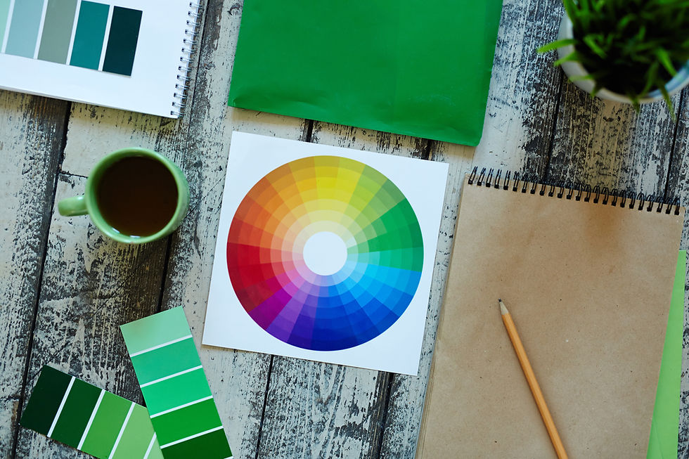
I thought I understood colour. Then came floristry. I was taught the colour wheel in art class at school and then again while studying art in college. When I trained as a florist, I learned it all over again. Every time, I loved it. After 35 years designing with flowers around the world, I’ve realised something surprising: The most important lesson about colour isn’t on the wheel at all.
The colour wheel gave me the foundation. It taught me about relationships between colours, contrast, harmony and balance. But as florists, we don’t work with perfect blocks of colour; we work with nature. We talk about blue, yellow and pink as though they are fixed colours, when in reality flowers exist in hundreds of subtle variations. Those tiny shifts in undertone are where sophisticated floral design is born.
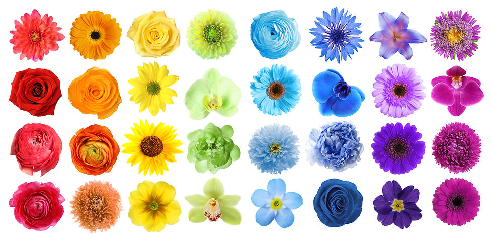
A butter yellow is not the same as a daffodil yellow. A dusty rose is not the same as a raspberry pink. A turquoise-leaning sky blue behaves completely differently from a cooler blue with violet undertones.
This is where colour literacy begins. Colour literacy is the ability to recognise, interpret and intentionally compose colour relationships beyond simple hue recognition. It is understanding not just what colour something is, but why it works, or doesn’t work, with the colours around it.
Looking Beyond the Hue
Take mustard yellow and a bright sky blue. On paper, there’s nothing technically wrong with the combination. Yet together they can feel visually abrupt, almost jarring. The eye bounces between them with nowhere comfortable to rest. Many people instinctively reach for white to soften the combination, but I rarely would. White often increases contrast, creating separation rather than harmony.
Instead, I look for a bridge, a transitional colour that allows the eye to travel naturally through the palette. Perhaps a raspberry pink or a warmer rose pink; the exact choice depends on the undertones already present. That single adjustment can completely recalibrate the palette, allowing each colour to support the others rather than compete with them.
This is where floral design becomes wonderfully precise. The slightly warmer pink can transform the entire arrangement; a cooler pink might undo everything. The difference can be so subtle that clients don’t consciously notice it, but they instinctively feel it.
Every colour has a visual weight, a temperature, a level of luminosity and a personality. Balance isn’t achieved by adding more colour but by introducing exactly the right colour in exactly the right proportion. Sometimes only a few stems are enough.
The Art of Visual Calibration
Nature makes this even more fascinating because flowers rarely produce identical colours. Take blue Tweedia (Oxypetalum). It has that unmistakable luminous sky blue, but look closely and there is the faintest whisper of turquoise running through it. Compare it with pale blue Delphinium and you’ll find another interpretation of sky blue, similar yet carrying a completely different character.
Blue Hydrangea offers something else again, often displaying several blue tones within a single bloom, each petal responding differently to soil chemistry and light. Technically, they are all blue. Visually, they are speaking completely different dialects.
This is why experienced florists stop thinking only in primary colours and begin thinking in nuances. They don’t ask, “Do these colors work together?” They ask, “What tiny shift in warmth, coolness or saturation will allow these colours to sing?” I call this process visual calibration.
The artistry begins when we understand colour deeply enough to move beyond the obvious.
Visual calibration is the deliberate adjustment of colour relationships within a floral composition; the careful balancing of hue, temperature, value, saturation and proportion until every element feels connected and intentional. It is the difference between simply selecting colours and composing with them. The colour wheel was never meant to limit creativity; it gives us the foundation. The artistry begins when we understand colour deeply enough to move beyond the obvious.
Understanding Tints, Shades and Tones
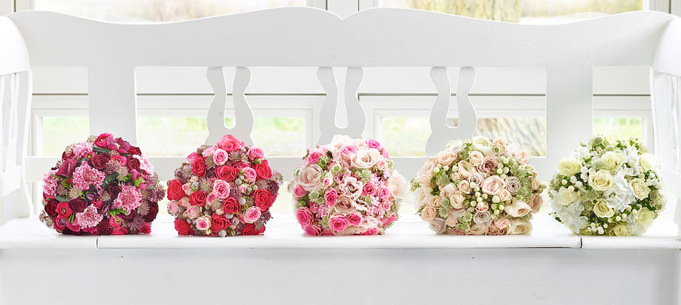
Florists think in colours; the best florists think in versions of colours. A tint is the lighter expression of a color. Think butter yellow instead of daffodil yellow, blush instead of cerise, or the palest blue Delphinium rather than its more saturated cousin. Tints bring lightness, air and elegance.
A shade is the deeper expression of a colour. Burgundy is a shade of red. Plum is a shade of violet. Midnight blue carries far more visual weight than sky blue. Shades add drama, depth and structure to a design.
A tone is where many of today’s most desirable flowers live. A tone is a colour whose intensity has been softened, creating colours that feel calm, refined and wonderfully easy to combine. This is the home of the vintage palette.
'Café au lait' Dahlia, dusty rose, antique carnation, mushroom Chrysanthemum and smoky lisianthus are not simply pale colours; they are tonal colours. Their slightly greyed quality removes the harshness of full saturation, allowing them to sit comfortably beside one another.
Nature creates these subtleties without ever opening a paint tin. Our job as florists is to recognise them. This is where colour literacy becomes a practical design skill.
Colour as a Sensory Experience
Floristry is one of the most multisensory art forms. We don’t just see colour, we feel the texture of petals between our fingers, we respond to scent as it rises from a freshly conditioned stem and we experience the visual impact of colour as it shifts in different light. Touch, smell and sight are all working together at once, which is why colour decisions in floristry are never purely visual; they are emotional, physical and instinctive.
In floristry, it’s rarely the loudest colour that makes the biggest impact, it’s the one that understands its place within the palette. A salmon blush sweet pea is a perfect example. Its delicate warmth can act as a bridge between cooler and softer tones, allowing neighboring colours to breathe rather than compete. It doesn’t demand attention through intensity, but through nuance. When that salmon blush sweet pea floats above the other blooms, we give this most ethereal flower an intentional place where all its charms are on display.
If there is one principle to take away, it is this: learn to see beyond the hue and trust the relationships between tones, not just the colours themselves. When you begin to design with that awareness, every stem becomes part of a conversation rather than a standalone statement. That is where true refinement begins—when colour stops being something you choose and becomes something you compose.
So here is a simple question to take back to your workbench: When you look at your fresh stock today, can you describe your palette in more than just colour names? Can you recognize whether your colours are warm or cool, muted or vibrant, soft or high contrast? More importantly, can you see why they truly belong together? Perhaps great floristry isn’t simply about choosing beautiful flowers. Perhaps it’s about becoming fluent in colour.

Florists' Review is a leading monthly trade magazine for the retail and wholesale floral industry, published since 1897. Based in Kansas USA, it serves a global audience, providing floral professionals with design inspiration, business insights, trends, and product information.
Jil Peterson is a floral designer, writer and wedding flower consultant. With more than 35 years in international floristry, she is passionate about the future of the industry and the evolution of floral design. She is based in Coleraine, Northern Ireland.






Comments